Skip to content
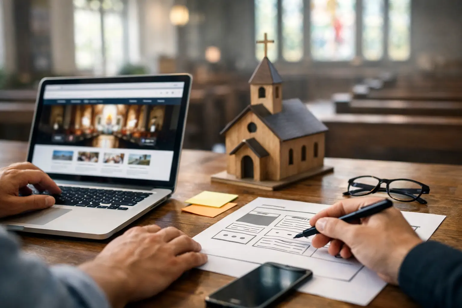
A family may look at your church website late on a Saturday night, hoping to answer one simple question before Sunday: “Will we know what to do when we arrive?” Knowing how to plan a church website starts there. Your website is not simply a place to post announcements. It welcomes people before they ever walk in, gives regular attenders a reliable place to stay connected, and helps ministry leaders communicate clearly.
A good plan keeps the project from becoming overwhelming. Instead of beginning with colors, layouts, or a long list of features, begin with the people you serve and the next steps they need to take. That approach creates a website that feels like your church: clear, warm, useful, and ready to support ministry all week long.
Start with the questions a guest will ask
First-time guests should not have to dig for basic information. Before you plan pages or gather photos, write down the questions someone may ask when they have never visited your church before.
What time are services? Where are you located? What should I wear? Is there something for my children? Is the building accessible? What can I expect when I arrive? How do I contact someone if I have a question?
These questions are practical, but they carry pastoral weight. Clear answers reduce anxiety for people who may be visiting church for the first time in years, bringing children to a new environment, or looking for a faith community during a difficult season. Put these answers in easy-to-find places, especially on your homepage and a dedicated Plan Your Visit page.
Your service times, address, parking guidance, and a visible contact option should never be buried in a menu. If your church has more than one campus or service style, be specific. A guest should be able to understand which service is right for them without making a phone call first.
How to plan a church website around next steps
Every church website serves more than one audience. Visitors need confidence about attending. Members need current information. Parents need children’s ministry details. People exploring faith may want sermons, beliefs, or a way to ask for prayer. Ministry leaders may need a simple way to promote events and recruit volunteers.
Trying to give every audience equal attention on every page creates clutter. Instead, decide on the most important next steps your website should support. For many churches, those include planning a visit, watching a sermon, viewing events, giving online, requesting prayer, and getting connected with a group or ministry.
Choose a small number of primary actions for the homepage. A clear button that says “Plan Your Visit” is more helpful than several vague invitations. “Watch Sermons,” “Give,” and “Upcoming Events” are also familiar, direct choices. Your church may need different priorities, and that is fine. A smaller congregation with a close-knit local community may emphasize service information and personal contact. A larger church with multiple ministries may need clearer pathways for campuses, groups, and children’s check-in.
The goal is not to make every ministry compete for attention. The goal is to help each person take one meaningful next step.
Gather the content before design begins
Many website projects slow down because the church begins design before deciding what information belongs on the site. Gathering content early makes approvals easier and helps your website launch with useful, accurate information rather than placeholder text.
Start with the essentials your team can realistically keep current:
- Service times, location details, directions, parking, and accessibility information
- A brief welcome message and a clear description of what guests can expect
- Current staff or leadership information, with approved photos and contact details where appropriate
- Children’s and student ministry details, including check-in, safety, and age-group information
- Sermon messages, event details, online giving information, and ways to request prayer or contact the church
Do not feel pressure to write your entire church history or post every ministry detail at once. A concise beliefs page, a warm church story, and a few clearly written ministry pages are usually more effective than long, unfinished sections. You can expand over time.
Photos matter too. Authentic images of worship, fellowship, children’s ministry, serving, and community life help people picture themselves in your church. Use current, well-lit photos that reflect your congregation honestly. Stock photography can fill a gap, but it should not replace the real people and ministry that make your church distinct.
Create a simple page map
A page map is a plain-language outline of what your website will include. It helps your leadership team agree on priorities before anyone debates design details.
Most church websites need a focused homepage, a Plan Your Visit page, About or Beliefs pages, sermons, events, giving, ministries, contact information, and a privacy policy. Depending on your church, you may also need pages for groups, missions, care, baptism, volunteer opportunities, or multiple locations.
Keep the main navigation short. When every ministry receives its own top-level menu item, visitors can feel lost before they begin. Group related content under simple labels such as “About,” “Connect,” or “Ministries.” The exact wording should match language your congregation already understands.
Think of the homepage as a welcome area, not a filing cabinet. It should introduce your church, show the most important next steps, share current information, and direct people to deeper pages when they need them. A homepage does not need to contain everything. It needs to make the right things easy to find.
Plan for phones before desktops
Many people will visit your website from a phone while searching for directions, checking a service time, or deciding whether to attend. Mobile planning should shape the project from the beginning.
On a small screen, large blocks of text, crowded menus, and tiny buttons create frustration. Keep paragraphs short, make calls to action easy to tap, and use clear headings so readers can scan quickly. Test every important task on a phone: finding Sunday service times, viewing an event, watching a sermon, submitting a contact form, and giving online.
Mobile-friendly design is not only a technical preference. It is part of being considerate of people’s time. If someone needs help getting to your church, the answer should be available in seconds.
Decide who will keep the site current
A beautiful website loses trust when last Christmas’s events remain on the homepage or service times are outdated. Before launch, assign ownership for routine updates.
That does not mean one volunteer must carry every responsibility. A church administrator may update events, a communications leader may add sermon notes, and ministry leaders may provide details for their own pages. What matters is having a simple process: who submits changes, who approves them, and who publishes them.
Choose tools your team can use without technical training. The best website platform is not necessarily the one with the most options. It is the one your church can manage consistently. If your team is stretched thin, ongoing support from a real team can be more valuable than complicated features you rarely use.
Include giving, forms, and integrations with care
Online giving should be easy to find, secure, and clearly connected to your existing giving provider. Keep the process familiar and avoid sending people through unnecessary steps. Explain, in a sentence or two, how gifts support the ministry if that is helpful for your church.
Forms can also make ministry more accessible. A visitor form, prayer request form, volunteer interest form, or event registration can help people respond when they are ready. Ask only for information you truly need. A lengthy form can feel like a barrier, especially for someone who is just beginning to explore your church.
If you use a church management system, livestream platform, calendar, or email tool, decide early what needs to connect to the website. Integrations can save time, but they should serve clarity. If an embedded calendar is difficult to read on mobile, a simpler events page may be the better choice.
Build in time for review and prayer
Website planning works best when it includes a realistic approval process. Choose a small group that can review content, confirm factual details, and make decisions without creating too many rounds of feedback. Your pastor, administrator, communications leader, and a trusted ministry representative may be enough.
Review the website as a guest, not only as an insider. Ask someone unfamiliar with your church to find the service time, children’s information, location, and contact form. Notice where they hesitate. The clearest feedback often comes from people who do not already know your internal language or ministry structure.
At Church Websites, the planning process is designed to give churches clear guidance, collaborative approvals, and support after launch. Whether you work with a specialized church partner or an internal team, you do not need to have every answer before the project begins. You need a clear purpose, honest information, and a willingness to make the visitor’s experience a ministry priority.
Your church website can become a quiet first welcome: a place where someone finds a service time, hears a message of hope, asks for prayer, or takes the courage to visit. Plan it with the same care you would give to greeting someone at the door, and let it make room for the next person God brings your way.